Deliver when you want, whenever you want.
Grey Ticket came to us with an idea of creating a simple solution to a convoluted system for the local goods transportation logistics that is highly dependent on partnerships or word of mouth in the B-2-B sector.
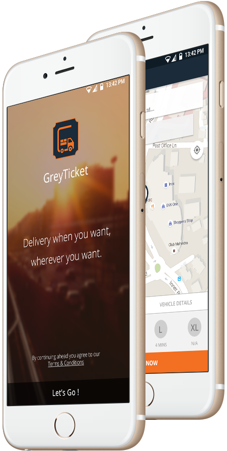
What did we do?
So similar to how Uber changed
the user oriented market when it comes to on-the-go taxi services , Grey Ticket is the answer to the local goods delivery
system for the on-the-go business users looking for an efficient and simple solution that is completely hassle free.
In 4 months, we have built an android app for customers and drivers and a web admin portal for the business to manage its
operations.
Brainstorm
Discover & debate possibilities of approach towards a feasible fast-paced UX.
Charge ahead
Putting the design into action & develop the idea into an application.
Englighten
A minimalistic UI coupled with on-the-go light-weighted application supported on all devices.
Analyse
Intense testing & statiscs based critical analysis for improving the app.
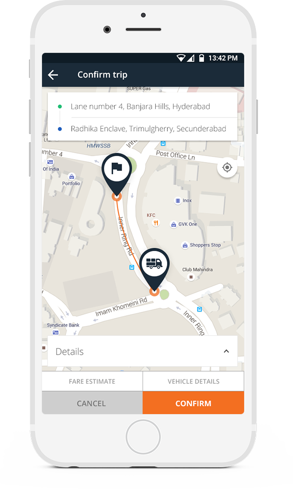
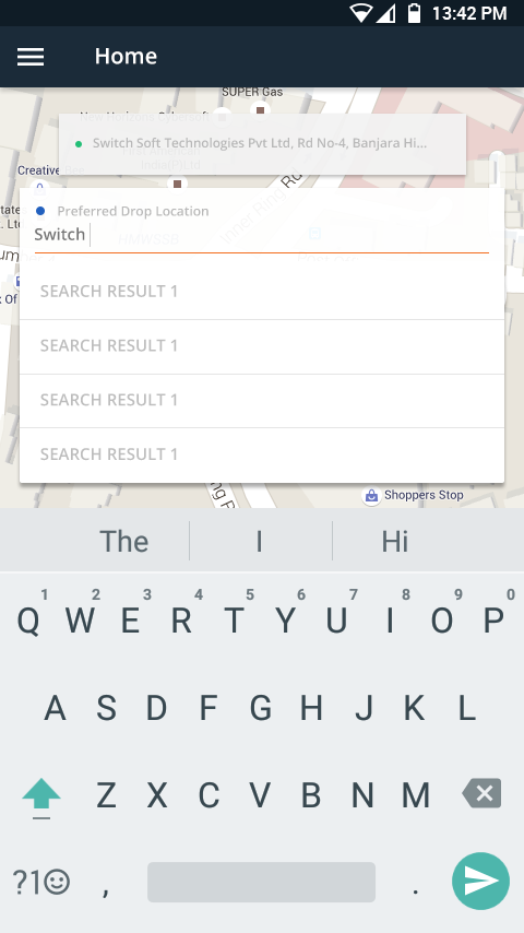
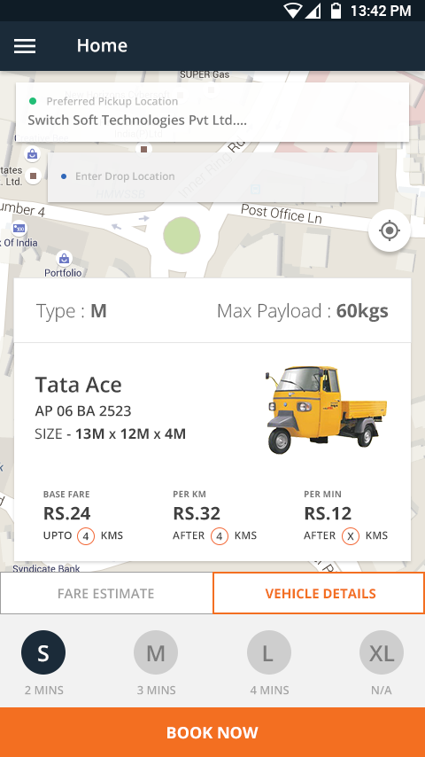
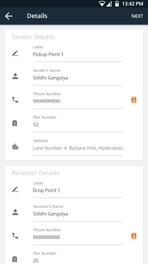
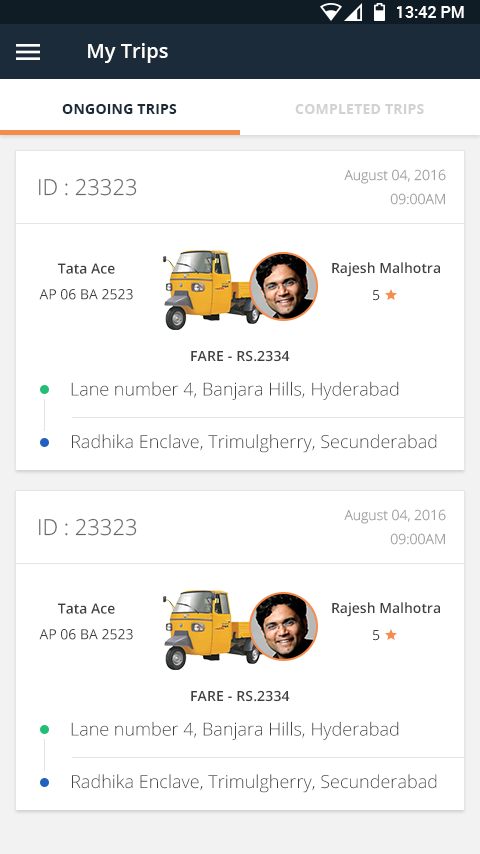
App Screenshots
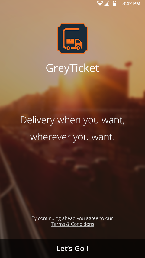
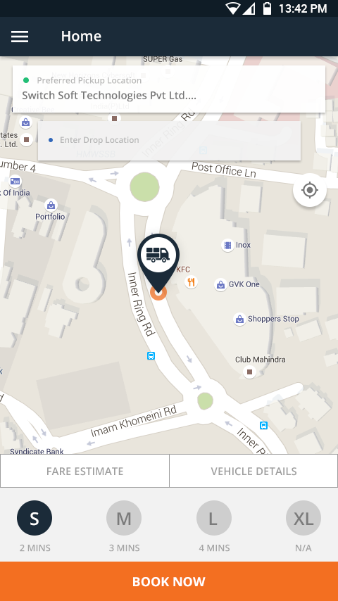
Curating screens we love from the application.

Technologies Utilised
Grey Ticket is an app that relies heavily on real time geo-data & for it we needed to optimise our webservices. We had to come up with iterations for an algorithm to choose the most efficient logic so that the application behaved in a fast paced manner to match the heavy load of the trolley business.

Minimalist Approach
The idea behind Grey Ticket's UI is to keep it simple & light. Heavily borrowing elements from material design yet minor tweaks to create it's own style. This approach helps us because users across many android devices can have access to the app. And yet, retain a neat look on higher end phones at the same time. But the role always being to fulfill it's role to provide a seamless experience.
